Choosing beach wedding colors is all about balancing the natural beauty of the environment with a couple’s personal style.
There is something undeniably magnetic about a wedding by the water. Between the rhythmic pulse of the tide and the endless horizon, the ocean provides a natural masterpiece as your backdrop. But as any coastal bride or groom knows, the challenge lies in choosing a color palette that feels like an extension of that beauty, rather than a distraction from it.
The shifting blues of the water, the pale warmth of the sand, and the brilliant light of the sun all play a role in how your wedding looks and feels. If your colors are too bold, they may clash with the serenity of the shore; if they are too muted, they risk getting lost in the bright, open air.
When my best friend told me she was getting married on the beach, I’ll admit I was a little nervous about how it would all come together. But the moment I saw her ceremony setup with the ocean as her backdrop, everything clicked. The colors she’d chosen didn’t compete with nature—they danced alongside it. That’s when I realized: the ocean isn’t just a location for your wedding, it’s your most stunning design partner.


Check more coral bridesmaid dresses in different style from Happyprom.co.uk now.
In this guide, we’re diving into five stunning color schemes specifically designed to complement the ocean. Whether you are dreaming of a soft, ethereal ceremony at sunrise or a vibrant, tropical celebration under the palms, these palettes will help you anchor your vision and create a day that feels as timeless as the sea itself.
Why the Ocean Is the Perfect Canvas for Your Wedding
There’s something magical about saying “I do” with your toes in the sand and the rhythmic crash of waves as your soundtrack. The ocean brings a natural palette that’s constantly shifting—from turquoise shallows to deep navy depths, from golden sunrise to blushing sunset. Unlike a traditional venue where you’re starting from scratch, the beach gives you an incredible foundation to build upon.
The key is choosing colors that complement rather than clash with this ever-changing backdrop. You want your wedding palette to feel like it belongs there, like it was always meant to be part of that shoreline. When you get it right, your photos will look effortless, your guests will feel immersed in the beauty, and you’ll create an atmosphere that’s both romantic and relaxed.
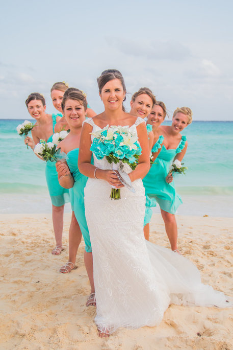
The Classic Coastal: Soft, Airy, and Timeless
If you want your wedding to feel like a natural extension of the shoreline, the Classic Coastal palette is your perfect match. This scheme focuses on a trio of colors—seafoam green, dusty blue, and sand beige—that directly mimic the immediate surroundings of a pristine beach.
It’s a palette that doesn’t compete with the view; it highlights it. Here is how to bring this breezy, sophisticated look to life:
- Seafoam Green: This shade captures the color of the shallow water where the waves begin to break. It’s refreshing and light, making it an ideal choice for bridesmaid dresses or sea-glass accents on your tablescapes.
- Dusty Blue: Think of this as the “hazy” blue of the horizon where the sky meets the sea. Because it has a grey undertone, it feels more sophisticated and “bridal” than a standard sky blue. It works beautifully for groom’s linens or watercolor-style invitations.
- Sand Beige: This is your essential neutral. By using a warm beige instead of a stark white, you bridge the gap between your decor and the literal ground beneath your feet. Use this for linen table runners, wooden cross-back chairs, or woven pampas grass arrangements.
Why it works: This combination creates a “monochromatic” feel with nature. Because these colors are already present in your environment, the overall aesthetic feels incredibly calm and cohesive. It’s the visual equivalent of a deep, relaxing breath of salt air.
Styling Tip: To keep this palette from looking too flat, mix in plenty of textures. Think raw silk, bleached driftwood, and matte ceramics. These elements add depth to the soft colors without breaking the “airy” spell.


Order: dusty blue water-color acrylic wedding invitations HPI305
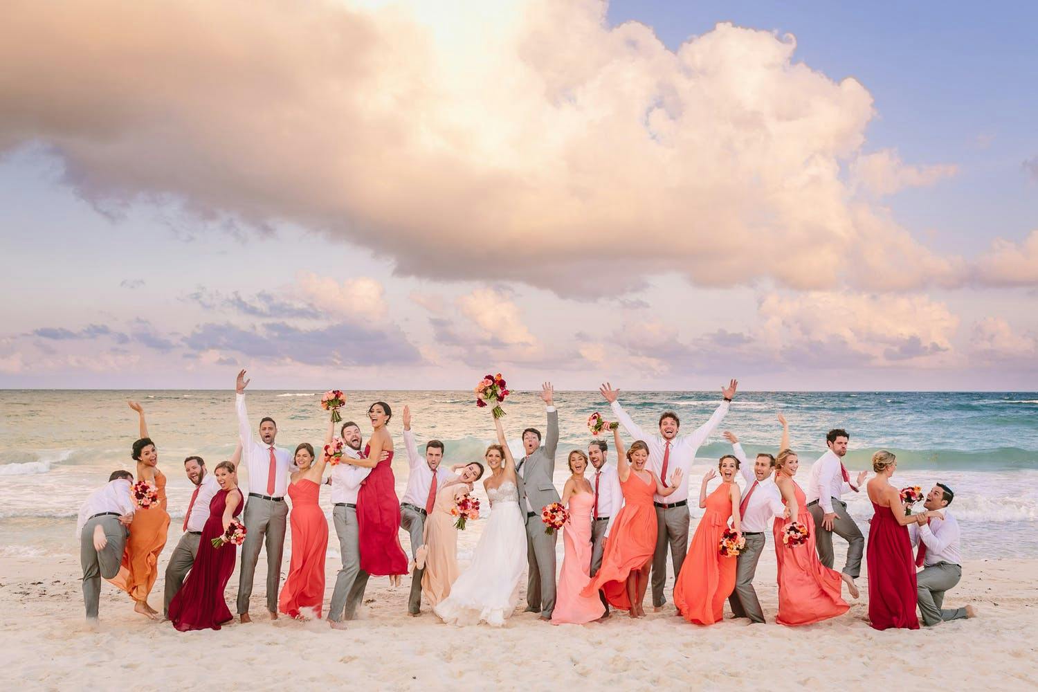
The Sunset Glow: Warm, Radiant, and Romantic
While the ocean is often associated with cool tones, there is no moment more magical than when the sun begins to dip toward the horizon, painting the sky in shades of gold and fire. The Sunset Glow palette—featuring terracotta, peach, and coral paired with deep gold—captures that fleeting “Golden Hour” and brings a sense of warmth and energy to the shoreline.
This palette is designed to pop against the blue of the water, creating a stunning visual contrast that feels both modern and deeply romantic.
- Terracotta: This earthy, clay-inspired red provides the “grounding” element for the palette. It mimics the color of sun-drenched cliffs or heat-baked sand. Use terracotta for velvet ribbons, ceramic vases, or even the groom’s tie to add a sophisticated, bohemian edge.
- Peach & Coral: These are your “light” and “vibrant” layers. Peach adds a soft, skin-flattering glow to bridesmaid gowns, while coral brings a punch of tropical energy to your floral arrangements. These colors are scientifically proven to look incredible against a blue ocean backdrop.
- Deep Gold: Gold is the “sunlight” of your color scheme. Rather than silver or chrome, use polished or brushed gold for cutlery, rimmed glassware, and jewelry. It mimics the way the sun sparkles on the surface of the waves.
Why it works: These colors are “complementary” to the blue of the ocean on the color wheel. Because orange-tones sit opposite blue-tones, they naturally make each other appear more vivid. This palette ensures that your wedding decor stands out brilliantly, even in the vast openness of the beach.
Styling Tip: To keep this look from feeling too “hot,” balance the warm tones with plenty of natural greenery. Deep monstera leaves or eucalyptus can provide a cool visual break that makes the sunset colors feel even richer.


Get the maxi peach bridesmaid dress with cap sleeves
The Nautical Chic: Bold, Sophisticated, and Structured
If you love the idea of a seaside wedding but want to maintain a sense of formality and “clean” lines, the Nautical Chic palette is the ultimate choice. Moving away from the soft, flowing vibes of other coastal styles, this scheme utilizes navy blue, crisp white, and compass gold to create a look that feels polished, high-end, and perfectly tailored.
This is the “Black Tie” version of a beach wedding—think yacht clubs, private docks, and elegant coastal estates.
- Navy Blue: This is your anchor. Navy is timeless and provides a powerful contrast against the white sand and light sky. It works exceptionally well for structured elements like blazers, striped table runners, or high-quality paper invitations with navy ink.
- Crisp White: Unlike the ivory or “warm whites” used in boho themes, Nautical Chic thrives on a sharp, bright white. It mimics the look of a sailboat’s sails or a starched captain’s uniform. Use white for linens, large floral installations (like white hydrangeas), and architectural decor.
- Compass Gold or Silver: Metallics here should feel intentional and “heavy.” Gold accents (reminiscent of brass ship fittings) or silver (like polished chrome) add a layer of luxury to the palette. Think metallic napkin rings, foiled stationery, or even metallic buttons on a custom suit.
Why it works: It’s a high-contrast palette. In the vast, bright expanse of a beach, the deep navy provides a visual “stop” for the eye, making the wedding setup look organized and intentional rather than scattered. It’s a palette that never goes out of style and looks just as good in twenty years as it does today.
Styling Tip: To prevent this look from feeling too “stiff,” lean into classic patterns. A subtle navy-and-white stripe or a sophisticated nautical knot motif can add personality without losing the elegance. Pair these with crisp, green foliage like boxwood or lemon leaves for a preppy, coastal finish.


Order: Navy Blue Pocket Wedding Invitation
The Tropical Punch: Vibrant, Playful, and Exotic
For the couple that wants their wedding to feel like an upbeat celebration, the Tropical Punch palette is the ultimate choice. This scheme leaves the muted neutrals behind and embraces the saturated, high-energy colors found in a lush island paradise. By mixing bright turquoise, fuchsia, and lime green, you create a festive atmosphere that perfectly complements the vivid blue of a tropical shoreline.
This palette isn’t about blending in—it’s about standing out with confidence and joy.
- Bright Turquoise: This shade mimics the crystalline, shallow waters of a Caribbean lagoon. It’s a “happy” color that works beautifully for glassware, bridesmaid accessories, or even a bold watercolor cake design.
- Fuchsia: Every tropical palette needs a “wow” factor, and fuchsia is it. Inspired by bougainvillea and hibiscus flowers, this deep, hot pink adds a romantic yet electric energy to your floral arrangements and bouquets.
- Lime Green: To keep the palette feeling fresh and “organic,” lime green is essential. It represents the lush jungle canopy pressing up against the sand. Use this through monstera leaves, green orchids, or even fresh citrus garnishes in your signature cocktails.
Why it works: In the harsh, bright light of the midday sun, dark or muted colors can sometimes look heavy or dull. Tropical colors, however, thrive in high-intensity light. They look even more vibrant under a clear sky and provide a stunning, high-contrast look against both the white sand and the deep blue ocean.
Styling Tip: When working with such bold colors, use natural wood or bamboo as your base. The brown, “earthy” tones of wood act as a neutral anchor that prevents the bright colors from feeling overwhelming. Think bamboo chairs, wooden chargers, or a reclaimed wood bar.


Pro Tips: The Science of Beach Photography & Color
The beach is one of the most beautiful—but most challenging—locations for photography. The combination of reflective water, white sand, and a lack of shade acts like a giant lighting studio. Here is how to ensure your chosen colors look as good in your wedding album as they do in person.
1. Beware the “Blue Bounce”
The ocean and the sky act as massive blue reflectors. On a clear day, this can cast a subtle blue tint onto everything—especially white dresses and light grey suits.
- The Fix: If you want a crisp, clean look, choose a “Warm White” or ivory for fabrics rather than a “Cool Blue-White,” which can turn slightly lavender or grey in bright seaside photos.
2. The “Disappearing Pastel” Effect
Bright, direct sunlight “flattens” colors. A very pale blush or a light mint that looks distinct in your living room may look completely white in a beach photo.
- The Fix: If you love pastels, go one shade deeper than you think you need. A “dusty rose” will photograph like a “soft pink,” whereas a “soft pink” might just look like a faded white.
3. High Contrast is Your Best Friend
Because sand and sky are relatively “flat” backgrounds, your bridal party can sometimes blend into the landscape if their outfits are too close to the color of the sand or the hazy horizon.
- The Fix: Incorporate at least one anchor color in your palette—like a deep sea-glass teal, a rich terracotta, or navy. These darker tones provide “visual weight” and make the subjects of the photo pop against the bright background.
4. Watch Out for “Hot Spots” on Metallics
Gold and silver accents are stunning for beach weddings, but polished, high-shine surfaces can catch the sun and create “hot spots” (blinding white glares) in your photos.
- The Fix: Opt for brushed or matte metallics. Brushed gold, copper, or “antique” silver will glow beautifully in the sun without reflecting harsh light back into the camera lens.
5. The Golden Hour Shift
The colors you see at a 2:00 PM ceremony will look entirely different at a 6:00 PM reception.
- The Tip: Mid-day sun favors cool tones (blues, greens, purples). The “Golden Hour” (just before sunset) adds a heavy yellow/orange filter to everything. If your palette is heavily warm (corals and oranges), they will become incredibly intense and vibrant as the sun goes down.
Tips for Coordinating Your Colors with Sand, Sky, and Water
Now that you’ve fallen in love with a palette, let’s talk about making it work seamlessly with your beach environment. The natural elements at your venue aren’t just background—they’re active participants in your design.
Work with Your Beach’s Unique Characteristics
Not all beaches are created equal, and that’s a good thing. A beach with white sand and crystal-clear turquoise water will showcase colors differently than one with golden sand and darker Atlantic blue water. Visit your venue at the time of day you’ll be getting married and really look at the colors around you. Take photos. Notice how the light affects everything.
If your beach has dramatic rock formations or cliffs, consider how your colors will look against gray stone. If there’s lush vegetation nearby, think about how your palette interacts with all that green. You want harmony, not competition.
Consider the Time of Day and Lighting
Morning weddings have cooler, crisper light that makes blues and whites look especially fresh and clean. Midday sun is bright and intense, which means deeper, more saturated colors can hold their own. Late afternoon and evening bring that magical golden light that makes warm colors absolutely glow.
If you’re getting married at sunset, remember that your photos will be backlit and golden. Lighter colors in your palette will catch that light beautifully, while darker colors will create dramatic silhouettes. Plan accordingly based on the look you want.
Balance Your Saturation Levels
Here’s something I learned from a wedding planner friend: you want different levels of color intensity in your palette. If everything is super saturated and bright, it can feel overwhelming. If everything is muted and soft, it might not have enough presence against the vastness of the ocean.
The sweet spot is mixing intensities. Maybe your bridesmaid dresses are a muted sage, but your floral arrangements have pops of brighter color. Or perhaps your linens are soft and neutral, but your stationery has bolder hues. This creates visual interest and depth while still feeling cohesive.
Don’t Forget About Texture
Color isn’t just about hue—it’s also about how light interacts with different materials. At a beach wedding, texture is your best friend for adding dimension. Incorporate natural materials like wood, rope, linen, and cotton alongside more refined textures like silk, velvet, or satin.
A simple cream-colored table can look completely different depending on whether it’s covered in a smooth polyester cloth or a textured raw linen. The natural imperfections and weave of organic materials feel right at home on the beach and add visual richness to your color palette.


Beach Wedding Color Schemes by Season
For 2026, the trend leans toward “bold meets balanced,” mixing traditional coastal pastels with vibrant, saturated accents. Here is a breakdown of beach wedding color schemes organized by season.
🌸 Spring: Soft & Ethereal
Spring beach weddings focus on rebirth and light. This season is perfect for “Sea-Glass” pastels and airy textures.
- Island Citrus & Mint: The 2026 “Color of the Year” pairing. A zesty, yellow-green (Island Citrus) paired with cool mint and crisp white.
- Periwinkle & Sand: A soft, romantic blue that mimics the spring sky, grounded by the warm beige of the shoreline.
- Peach & Sky Blue: Playful and fresh; this combination feels like a gentle sunrise over the Atlantic.
- Lavender & Silver: Whimsical and elegant, evoking the soft hues of sea lavender and shimmering tide pools.
☀️ Summer: Vibrant & Tropical
Summer is the time for high energy and saturated colors that can stand up to the bright, midday sun.
- Cobalt Blue & Canary Yellow: A bold, fashion-forward choice for 2026. This duo feels regal and modern against a deep blue ocean backdrop.
- Tropical Sunset: Fuchsia, mango orange, and papaya yellow. These “hot-on-hot” tones create an optimistic, high-energy atmosphere.
- Turquoise & Coral: The ultimate classic beach duo. It’s vibrant, fun, and mimics the colors of a tropical reef.
- Monochromatic Greenery: Layers of palm, emerald, and lime green with white accents for a lush, “jungle-meets-sea” aesthetic.
🍂 Fall: Warm & Moody
As the air cools, the palette shifts toward richer, earthy tones that reflect the “Golden Hour” light.
- Terracotta & Champagne: A top trend for 2026. It combines rustic, sun-baked earth tones with the luxury of champagne linens.
- Sea Salt & Burnt Orange: A coastal twist on traditional autumn colors. Use “sea salt” (a greyish-white) to keep the orange from feeling too “harvest-themed.”
- Navy & Burgundy: Deep, moody, and sophisticated. This works beautifully for an evening reception on the beach or a nearby yacht club.
- Dusty Rose & Sage: A softer fall option that feels organic and “wild,” especially when paired with pampas grass and dried beach elements.
❄️ Winter: Icy & Sophisticated
Winter beach weddings (often in warmer climates like Florida or the Caribbean) lean into “Quiet Luxury” and metallic finishes.
- All-White & Silver: A “Winter Wonderland” on the sand. Use different textures like silk, linen, and shells to create depth without adding color.
- Deep Teal & Copper: Teal mimics the darker winter ocean, while copper adds a metallic warmth that feels cozy yet coastal.
- Black Cherry & Creamy Ivory: For the modern, edgy couple. This high-contrast palette is dramatic and looks stunning in sunset photography.
- Midnight Blue & Gold: A timeless “nautical” vibe that feels more formal and elevated for a winter celebration.
Your Perfect Beach Wedding Is Waiting
Here’s what I want you to remember as you plan your beach wedding: there’s no single “right” color palette for the ocean. The right colors are the ones that make you feel something, that reflect who you are as a couple, and that create the atmosphere you want for your celebration.
The ocean is incredibly generous as a wedding backdrop—it’s constantly beautiful, always photogenic, and it brings its own magic to your day regardless of what colors you choose. Your job isn’t to match it perfectly or compete with it. Your job is to create a palette that feels like an extension of that natural beauty, something that honors the setting while telling your unique story.
Maybe you’re drawn to bold tropical colors because that’s how you approach life—with energy and joy. Or perhaps those soft, muted tones speak to you because you value quiet romance and intimate moments. Maybe you want classic navy and white because you love timeless elegance. All of these are beautiful choices.
Trust your instincts, work with the natural landscape, and don’t be afraid to add personal touches that make the day unmistakably yours. After all, this isn’t just a beach wedding—it’s your beach wedding. The ocean provides the canvas, but you’re the artist.
Frequently Asked Questions About Beach Wedding Color Scheme
What colors should I avoid for a beach wedding?
There aren’t really colors you must avoid, but I’d be cautious with anything that might blend too much with your surroundings and disappear. For example, all beige or tan might wash out against sand. Very dark colors like black can feel heavy for a beach setting, though they can work if balanced with lighter tones. Focus more on how your colors interact with the environment rather than ruling anything out completely.
How many colors should I include in my beach wedding palette?
A good rule of thumb is three to five colors maximum—one or two main colors, one or two accent colors, and your neutrals (like white, cream, or sand). This gives you enough variety to create interest without making your design feel scattered or overwhelming. Remember that the ocean, sky, and sand are already adding colors to your palette.
Can I use metallics like gold or rose gold at a beach wedding?
Absolutely! Metallics can add gorgeous sophistication to a beach wedding. Gold and rose gold are especially beautiful because they catch the sunlight and work well with the warm tones of sand and sunset. Silver and champagne tones are lovely too. Just use them as accents rather than overwhelming elements—think candleholders, flatware, or small decorative details.
What if my wedding colors don’t match the exact shade of the ocean?
Don’t stress about matching the ocean exactly—that would be nearly impossible anyway since the water changes color throughout the day and with weather conditions. Instead, think about colors that complement or harmonize with the ocean. You’re creating a cohesive color story, not trying to achieve a perfect match. The goal is for your palette to feel like it belongs in the beach environment.
Are pastel colors too light for a beach wedding?
Pastels can look absolutely stunning at a beach wedding, especially during golden hour or at sunset when the natural lighting is softer. The key is using them intentionally and adding some depth through layering, texture, and a few deeper accent colors. If you’re worried about pastels looking washed out, add touches of a richer complementary color or use textured materials that catch the light differently.
How can I incorporate local beach elements into my color scheme?
Look at what’s naturally present at your specific beach location. Are there colorful shells? Particular types of flowers or plants? Unique rock colors? Incorporate these elements into your decor and let them inspire accent colors in your palette. Using local elements not only helps your colors feel authentic to the setting but also creates a stronger sense of place for your wedding.
Should my wedding colors change if I’m having a sunset ceremony versus a morning ceremony?
While not necessary, it can be smart to consider timing. Cooler, brighter colors like crisp whites and blues look especially fresh in morning light, while warm colors like coral, peach, and gold literally glow during golden hour. That said, any well-chosen palette can work at any time—it’s more about being aware of how your colors will photograph in different lighting conditions.
Related Post:
Beach Wedding Planning Guide for the Bride
How to Make Your Beach Wedding Funny | Happyinvitation.com
Summer Beach Inspired Wedding Invitations